. TrueTag · UX Design · Data Visualisation · 2025

Weaving Data & Fashion
into a narrative. · TrueTag

Fast fashion hides its costs behind marketing language. TrueTag is a mobile app that scans clothing tags and translates complex environmental, social, and economic data into honest, readable insight so shoppers can see past the greenwash.

ForData-Driven Storytelling, UTS
RoleData Viz + Interaction Designer
DeliverableHi-fi Prototype · Design Film
ToolsFigma · FigJam · Adobe Firefly · Tableau
Year2025
↗ Try it out

Greenwashing works because complexity is invisible. TrueTag makes the hidden legible.

92M
tonnes of textile waste per year, globally
1
scan to see a garment’s true impact
3
data dimensions: environmental, social, economic
0
jargon. plain language only.

The problem with "sustainable"

The fashion industry generates an estimated 92 million tonnes of textile waste a year, yet brand communications reduce this to vague claims. "Eco-conscious." "Responsibly sourced." Terms that signal virtue while obscuring specifics.

This project started with a question: what would it take to give shoppers access to the same data supply chain auditors use, but in the five seconds they have at a rack?

"Consumers want to make ethical choices. The information simply isn't available to them in a usable form."

· Research framing, UTS brief
The core challenge
Data alone doesn't change behaviour. It has to be felt. The design task was translating water usage in litres and CO2 in kilograms into something a person standing in a changing room could actually act on.

Four things we kept running into

Desk research and rapid user interviews kept surfacing the same pattern: people knew something was wrong, but had no way to act on it.

01
The greenwash gap
Shoppers could identify sustainability language as potentially misleading, but had no reliable way to verify claims at the point of purchase.
02
Data overload fatigue
Too many competing sustainability certifications meant shoppers couldn’t tell which ones mattered. Most defaulted to price.
03
Comparison is what matters
Absolute numbers (200L of water per shirt) are hard to place. What lands is comparison: "this shirt used 4x the water of that one."
04
Labour is the blind spot
Environmental data gets the most coverage, but social and labour conditions were the dimension users cared about most once surfaced.

Making numbers feel like something

The visualisation work happened in two stages. First, building the data model in Tableau, tracking landfill waste across five major fast fashion brands over time, looking for patterns worth surfacing.

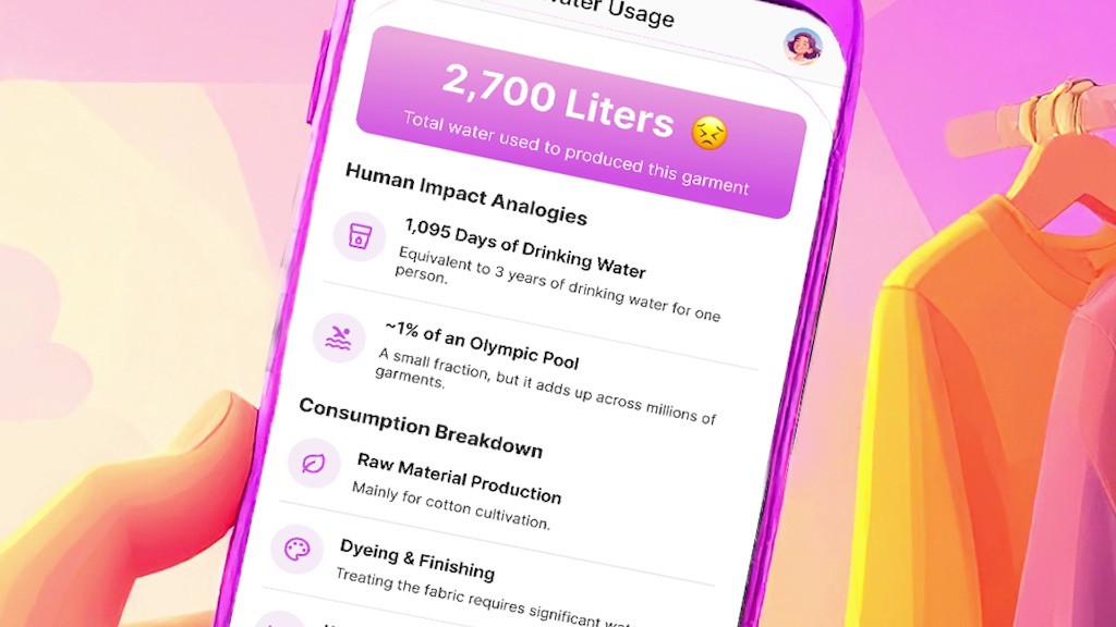
The harder problem was translation. Raw numbers don’t move people. 223,000 tonnes means nothing until it’s 22 Eiffel Towers. The infographic layer was about finding the right anchor for each metric so a shopper could feel the scale, not just read it.

Relative, not absolute
The comparison model is designed as an apples-to-apples view so users can understand impact quickly, without needing to interpret raw numbers first.
Data visualisation output
Infographic for comparison-first understanding

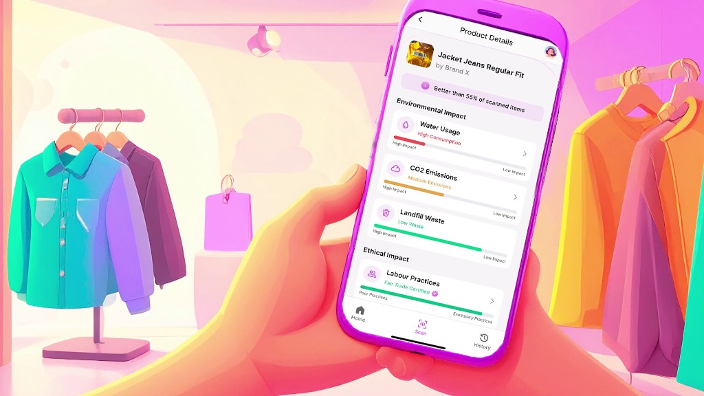
Three moments in the scan flow

01
The scan
Point at any clothing tag. The app reads the barcode or RFID chip and retrieves supply chain data from an aggregated database of brand disclosures and third-party audits.
02
The verdict
A single screen gives an overall impact rating plus the three most important facts about this specific item. Designed to be digestible in under five seconds.
03
The deep dive
Tap into any metric for full sourcing, methodology, and comparative benchmarks. Built for the shopper who wants to verify, not just trust the score.
App screens: scan, verdict, and deep dive breakdowns

The full story in motion

One scan at the rack tells you what the brand won’t. The true environmental, social, and labour cost of what you’re about to buy, in plain language, before you decide.

TrueTag concept video, UTS Data-Driven Storytelling, 2025

What this project taught me about data

The hardest design problem wasn't the visualisation. It was deciding what to leave out. Every additional data point added cognitive load and reduced the chance someone would act. Good data design is mostly editing.

I'd push the comparative framing further next time. The relative benchmarks tested well, but there's a version of this where you can compare two items side by side in real time at the rack, which is closer to how shopping decisions actually work.

"The best visualisation is the one that makes you forget you're looking at data."

· Edward Tufte (paraphrased)